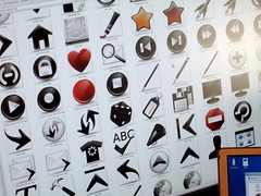
 I've spent last 6 days at Nuno's place in Vila Real, Portugal, together with Ken for an Oxygen meeting. Basically this can be called the 1st Oxygen icon workshop ever, and it went just great. We were highly productive and had a lot of stuff done and now I'm updating website contents with news, previews and ... more, in the next 24 hours (uhm, sounds like the announcement of an announcement).
We focused on a few most used KDE application and started working on actions icons and application icons. I'm really proud of the Kmail action icons.
 It was great to meet again Ken and Nuno, which was so cool to host the meeting in his (very beautiful) new apartment. We had the chance to do a nice trip along the Douro river to get to a restaurant that was close, but it was really fun.
-blz- breaking news -blz- I had my svn account to work (thanks David F.) -blz-
16 comments:
Yay, black is so overabused.
Wow, the kmail icons indeed look very good
Hi!
These icons look fantastic! :-) Perhaps it is time to get rid of the floppy disk as a symbol for "Save". I mean who uses floppy disks nowadays anymore? Perhaps KDE 4 is the right opportunity to change this symbol.
StefanB
>I mean who uses floppy >disks nowadays anymore?
++
Yes please, use a CD as icon for save.
Otherwise great work!
Maybe a CD with a Laser beam hovering over it?
A CD as "save" metaphor is bad as Floppy IMHO. When I see a CD in the toolbar, I imediately think of a burning CD tool.
I would like t otry using a generic-memory-card icon instead, it has a more similar shape to the old fashioned floppy.
What do you think?
Yes, floppy disk simbol isn't really much intuitive as a symbol of "save", especially for people who have never used computers before. But for now I have no idea what could be substitute...
How long will it be then until CDs or memory cards won't be recognized as devices where you can save stuff on?
The disk icon as it is now doesn't represent a current storage device, that's for sure. But IMHO it has already matured as a save icon and become the generic save icon we are all looking for. People who already use computers are acquainted to it. It would be them then who'd have to learn that a CD or memory card means "Save"...
It's a great work David :)
I just found the actions too black.
I'm thinking about bookmark, edit_add, bookmark,editpaste, flag, launch, reload, rool, the search ones, spread, view*
Also the "new message" icon in kmail should have some color because otherwise it's hard to say if it's active or not.
Kudos to the oxygen theme ;)
Great work man!
- Andreas Nilsson
About black actions.
The picture with the black actions was just to show the envoirnement, was not really intended as a preview. New stuff will be announced soon.
an SD memory card almost has the same form of a floppy diskette and can be used for the save icon, instead of the old floppy ( laptops dont even have floppy disk stations anymore ).
It shouldn't be SD card either. We are writing file to disk, not to SD card or floppy. Disk icon would be the most accurate, but also only for people which know that there is a hard disk drive inside of a computer :) Maybe someone will find some new better symbol for save icon.
Hm. Made in Portugal, with stars-n-stripes colors on the envelopes? ;) I thought envelopes like that were only used in the US, maybe I'm wrong; are they international ones of some kind? Enlighten me!
@ Elvis:
"Made in Portugal" is refered to where we was while doing these icons, it's a humoristic title in my intentions.
About red and blue on the envelopes, this is international. In Italy you can also find red and green, but red and blue with "Par Avion" label (so in french) are most common here.
Icon for saving.
Yes, the diskette is kind of outdated, but there is not much point in replacing it unless a better idea comes up. I agree with previous comments about CD (or is it a DVD ;-) not being a good replacement.
Arrows are used in some other icons, such as forward and next, reply and forward.
Would it be possible to create open and save icons which both use the folder metaphor with an outgoing arrow to represent opening a file and an arrow into the folder to represent saving?
One problem I see is that they must be easily distinguishable and that may be difficult to achieve with just arrows. Perhaps the saving icon could also use a closed folder image?
If you added a 'band' - red tape(!) - around the folder it could be tied when saving and open when opening? There's a danger in people interpreting it as a "close" icon though.
Anyway, the new icons look good. The air mail envelopes may steal attention as they became quite colourful, but it's a nice touch :-)
Post a Comment